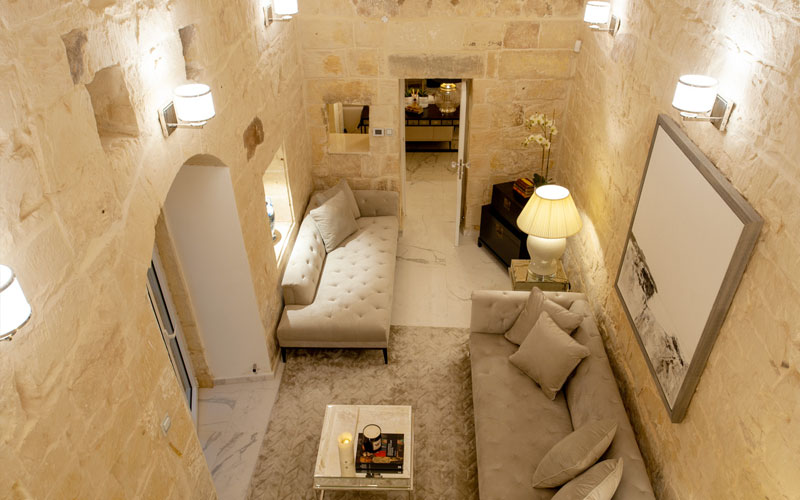
Interior Designer Kenneth Tanti meets Lillie Helena from Design & Decor magazine.
Interior Designer Kenneth Tanti meets Lillie Helena from Design & Decor magazine.
INTERIOR DESIGN Tanti Interiors
FURNITURE & FURNISHINGS Fabulous Home
WORDS Justine Lillie Helena
PHOTOGRAPHY Cyril Sancereau
Tanti Interiors have once again made quite the entrance on the interior design front by creating a home oozing sophistication whilst still maintaining a welcome feeling throughout.
I interview Kenneth Tanti to gather a detailed insight into their choices, challenges and inspiration.
As far as renovations go, this property takes the pick! Kenneth explains that this building was transformed from a shamble of rooms to the design statement it is today. “The space did not make any habitable sense at all, just little areas that lead into each other with even smaller outbuilds in the present courtyard” creating confusion for the clients of pretty much what goes where!
Farmhouses can sometimes be quite dark with not much natural light passing through. Was there an issue with light?
The property had an external staircase and minimal light entered the building due to the lack of windows. Now it boasts a huge glass wall which floods the property with light.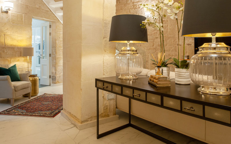
At what stage did you take over the design of this property?
Tanti Interiors were called in at a stage where structurally the house had been ready and needed our finishing touches. We drew up our plans and came up with the 3D visuals to show the client the true potential of the property. It looked Magnificent right away. We decorated the house with curtains, furniture and accessories from Fabulous Home in Msida, using beautiful brands such as Eichholtz, Signature & Harlequin Fabrics.
Due to this attention to detail we made sure that each room had its own signature statement.
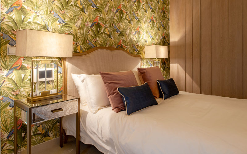
The wallpaper in the master bedroom is quite dramatic. Is there a reason for this, what kind of conversation did you have with the client to finalise on this wall covering?
The wallpaper from Fabulous in the main bedroom makes an impact but yet one can enjoy the rest of the tranquil atmosphere with the use of bronzes and the soft velvet pink armchair. These pieces too are from Fabulous. They all blend in well together. There is a mixture of classical, colonial and contemporary in this room. The woven floor rugs from Fabulous also contribute to the whole effect of the colonial style.
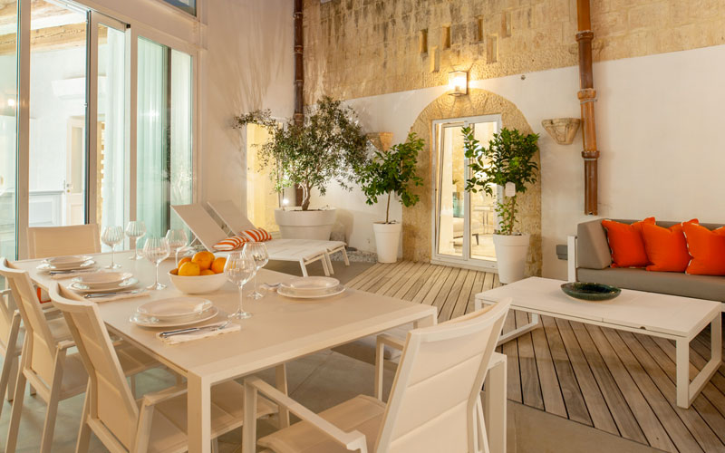
I love the minimal exterior space with the intense pop of orange. What was the brief for this area?
The outdoor area was purposely kept contemporary and easy, creating focal points with plants, lighting and the orange cushions for a pop of colour. A super practical space to entertain, relax or just look at from the inside.
Your kitchen feels like a mix of Classical due to details such as the cabinetry panelling, yet it is evident there are modern accents through the strip lighting, minimal style and ghost bar stools. What led to this design concept and how did you manage to obtain the correct balance between the different styles.
The kitchen is a fusion of styles. As you mention its classical meets modern. This is definitely a tricky balance to achieve. The kitchen looks like a picture when viewed from the outside and the large surface of the island makes it practical & functional to use and prepare delicious meals on. It really works as the hub of the house.
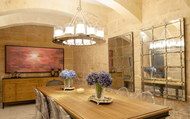
The soft colour palette of the space works well with the property’s bones. How did you decide on the colour palette?
The walls are either in white or in stone. Both very light in colour. We did not want to create sharp contrasts but a flow between tones. Natural finishes on most of the furniture we provided also contribute to this. Natural woods, light tones of vintage paint effects. However, having said this we also used pieces from Fabulous that still give that sophisticated feel.
What was your inspiration for the children’s bedroom?
This space is designed around a young boy. The colours and theme re?ect that vintage effect. Fabulous sewed the striped grey / white curtains that hang on eyelets and pole. These almost give that vintage beachouse effect. The beds, shelves and wardrobe were made bespoke by Tanti Interiors. All made to measure to ?t the room and have the possibility of another bed to pop up from under one of the single beds for friends sleep overs. All the toys and decorative items, again, contribute towards that consistent vintage feel. Adding a pop of colour there and here is also imperative for a child’s focus.
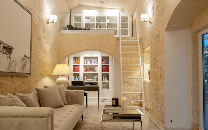
Pops of colour, attention to detail and colonial accents are just the beginning to the interest this property brings out. We feel that this space is a perfect example of how having a professional involved could bring out a lifetime of comfort and luxury in your home, not to mention the magic of entwining design styles.
We would like to thank Tanti Interiors & Fabulous Home for another stunning showcase.
INTERIOR DESIGN Tanti Interiors
FURNITURE & FURNISHINGS Fabulous Home
WORDS Justine Lillie Helena
PHOTOGRAPHY Cyril Sancereau
